


PANTONE Spring/Summer Fashion Colour 2015

Those colourful creative’s at PANTONE have recently published their Spring/Summer fashion colour report for 2015, and what an eye-catching colourful array it is!
Although none are suitable for hair colour - well we guess that is down to personal opinion - the latest colour trends are great inspiration for photo shoots and salon collections, not to mention some amazing eye makeup and nail colours.
This season there is a move toward the cooler and softer side of the colour spectrum. An eclectic, ethereal mix of understated brights, pale pastels and nature-like neutrals take centre stage. Remembrances of retro delights, folkloric and floral art, and the magical worlds of tropical landscapes restore a sense of well-being as we head into the warmer months – thank god!
Leatrice Eiseman, Executive Director of the Pantone Colour Institute said,
Many feel compelled to be connected around the clock because we are afraid we’ll miss something important. There is a growing movement to step out and create ‘quiet zones’ to disconnect from technology and unwind, giving ourselves time to stop and be still. Colour choices follow the same minimalistic, ‘en plein air’ theme, taking a cue from nature rather than being reinvented or mechanically manipulated. Soft, cool hues blend with subtle warm tones to create a soothing escape from the everyday hustle and bustle.
So, what are these fantastic summertime colours?
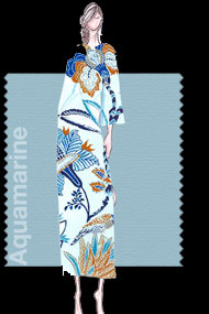 Aquamarine (PANTONE 14-4313)
The lead colour for women for the Spring/Summer 2015 season, PANTONE 14-4313 Aquamarine is an airy blue with a dreamy feel. Cool and calming, ethereal Aquamarine is a shade with a wet and watery feel. Open and expansive, this restful blue also acts as a stress reducer.
Designers currently using Aquamarine include Banjanan, BCBGMAXAZRIA, Cynthia Steffe, Pamella Roland and Rachel Pally.
Pairs well with PANTONE Glacia Gray and Marsala
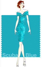 Scuba Blue (PANTONE 16-4725)
An invigorating turquoise, PANTONE 16-4725 Scuba Blue conveys a sense of carefree playfulness. Even though a cool shade, the vibrancy of Scuba Blue adds a splash of excitement to the palette. Scuba Blue offers a feeling of escape as it is reminiscent of a tropical ocean. This stirring and energizing shade takes us off to an exotic paradise that is pleasant and inviting, even if only a fantasy.
Designers currently using Scuba include Barbara Tfank, DEGEN, Tadashi Shoji, WHIT NY
Pairs well with PANTONE Classic Blue and Lucite Green
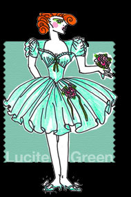 Lucite Green (PANTONE 14-5714)
Generally not thought of as a fashion colour, though it does come back from time to time, PANTONE 14-5714 Lucite Green is a soothing green shade whose time has really come again. Fresh and clarifying, cool and refreshing, Lucite Green has a minty glow. Light in weight and also in tone, Lucite Green seems almost transparent.
Designers using Lucite Green include Betsey Johnson, Christian Siriano and Monique Lhuillier
Pairs well with PANTONE Classic Blue and Scuba Blue
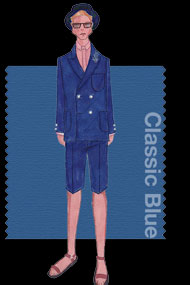 Classic Blue (PANTONE 19-4052)
Reliable and thoughtful, PANTONE 19-4052 Classic Blue inspires calm, confidence and harmony. Serving as an anchor to the Spring/Summer 2015 palette, Classic Blue is a shade that is strong and reliable. Just as with the sea, because of its waterborne qualities, this Classic Blue is perceived as thoughtful and introspective.
Designers used Classic Blue include David Hart, Perry Ellis, TiA CiBANi and Trina Turk
Pairs well with PANTONE Sandstone and Marsala
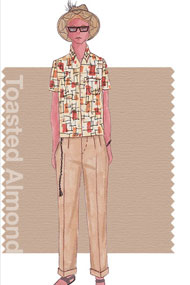 Toasted Almond (PANTONE 14-1213)
Bringing balance to the coolness of the Spring/Summer 2015 colour range is PANTONE 14-1213 Toasted Almond. A sun-tanned neutral, Toasted Almond offers comforting warmth and is indicative of a spontaneous spring, summer feeling. Timeless and versatile, Toasted Almond is an organic shade that speaks to authenticity and all that is natural.
Designers using Toasted Almond include David Hart, David Tlale, Jay Godfrey and Nonoo
Pairs well with PANTONE Lavender Herb
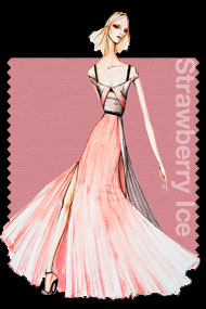 Strawberry Ice (PANTONE 16-1720)
Aptly named, PANTONE 16-1720 Strawberry Ice is suggestive of a cooling and refreshing delicacy, yet its warmth as a colour is quite appealing. Subtle and charming, Strawberry Ice is an ideal shade for Spring/Summer 2015. Both tasty and tasteful, Strawberry Ice is a confection colour that evokes a feeling of being “in the pink,” emitting a flattering and healthy glow.
Designers using Strawberry Ice include Bibhu Mohapatra, Ella Moss and Rebecca Minkoff
Pairs well with PANTONE Toasted Almond and Tangerine
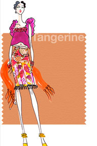 Tangerine (PANTONE 15-1247)
Spontaneous and gregarious, PANTONE 15-1247 Tangerine is a juicy orange shade that is energizing, yet not jarring to the eye. Versatile Tangerine is striking enough to stand on its own and adds vitality to a printed pattern. Good natured and friendly, but with a tangy edge, this fun-loving colour invites a smile.
Designers using Tangerine include Yoana Baraschi
Pairs well with PANTONE Toasted Almond and Strawberry Ice
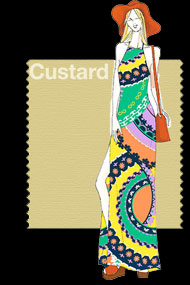 Custard (PANTONE 13-0720)
Just as the name implies, PANTONE 13-0720 Custard is a delicious and delectable yellow. Sweet and sunny, Custard is a cheering tone that brings thoughts of pleasant relaxation and comfort food. Engaging with its soft and mellow warmth and full of good feelings, subtle Custard has an affable and easy disposition.
Designers using Custard include Alice & Trixie, Nanette Lepore and Nicole Miller
Pairs well with PANTONE Classic Blue
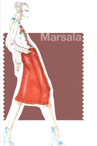 Marsala (PANTONE 18-1438)
Interesting on its own and a wonderful contrast for other hues, PANTONE 18-1438 Marsala serves as the foundation to the Spring/Summer 2015 palette. Sensual and bold, delicious Marsala is a daringly inviting tone that nurtures; exuding confidence and stability while feeding the body, mind and soul. Much like the fortified wine that gives Marsala its name, this robust shade incorporates the warmth and richness of a tastefully fulfilling meal, while its grounding red-brown roots point to a sophisticated, natural earthiness.
Designers using Marsala include Daniel Silverstain and Herve Leger
Pairs well with PANTONE Sandstone and Classic Blue
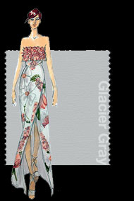 Glacier Gray (PANTONE 14-4102)
More dominant for men than women in Spring/Summer 2015, PANTONE 14-4102 Glacier Gray is an unobtrusive gray that contrasts and enhances; bouncing off other shades without t